Design Sprint Case Study: A Home Decor Solution
This is a modified version of the Google Ventures (GV) Design Sprint Framework focussing on solving the problem of decorating a new apartment
Overview
House2Home is a startup that wants to make it easier for people to decorate their new homes and apartments on a budget. It is an e-commerce application that sells home decor items like prints, posters, lighting, small accent pieces, and other accessories.
Through surveys, the company found that many of their customers have recently moved into a new home or an apartment. These users want to buy multiple items to personalize their new space, but don’t feel confident doing it on their own.
Constraints
-
The solution needs to be designed as a mobile application
-
The focus was on users who had moved into a new home and wanted to quickly decorate their apartment
-
The company caters to decorative items and accessories. They don’t sell furniture or any large pieces of decor
Role
My role as a UI/UX designer was to run a solo design sprint and find possible solutions to help people with this problem.
Process
The GV Design Sprint process undertaken was as follows:

Day 1: Understanding/Mapping
The first day of the design sprint was spent understanding the problem through user research. The focus was on users who moved into a new home or apartment and needed help with decorating it with tiny items.
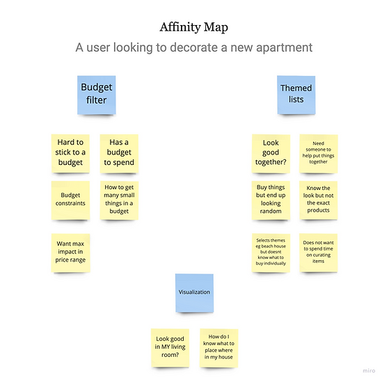
I picked up some of the key pain points from user interviews and bucketed them into broad categories
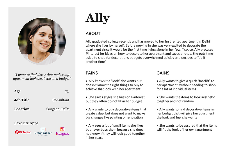
User Persona
The identified user persona highlights the frustrations and goals that the end-user had while shopping for decorative items online
How Might We Problem (HMW) Problem Statements
From the research synthesized, the following HMW statements were identified:
How might we buy multiple items within an overall budget?
How might we get items which belong to a particular theme that look good together?
How might we visualize how an item/set of items look in our own houses?
Mapping
I sketched a few routes that a user would take to purchase decor online. These were alternate steps that a user can take to achieve the outcome.

Day 2: Sketching
The second day began with lightning demos. This meant reviewing competitor products that were trying to solve a similar problem.
I scanned through Zara Home, Ikea, and HomeCentre to understand how items are grouped and to observe the visual styles used. I also stumbled upon the iPhone 12’s AR capability on Apple’s website which was an interesting feature where you could visually place a 3D model of the iPhone in your room using your phone camera.
Crazy 8's
The next step was to pick the most critical screen from Day 1’s Map and create 8 quick sketches in 8 minutes to ideate various iterations of this screen.
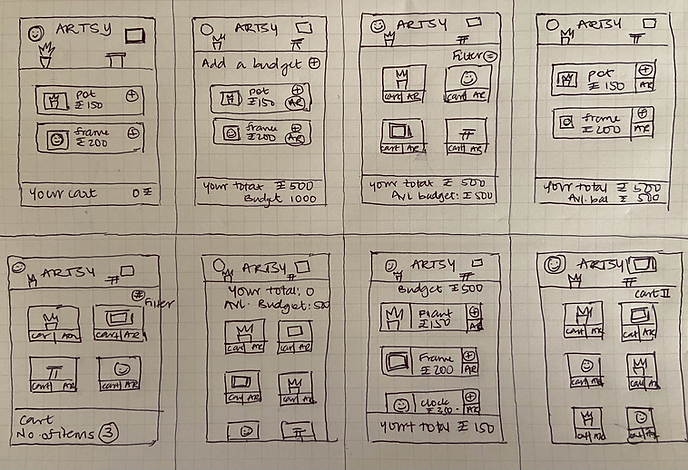
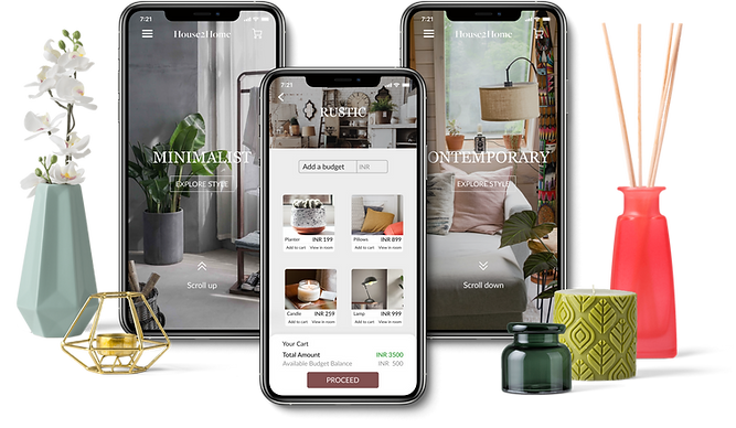
The screen I picked was a particular theme screen, where the user defines a budget and adds individual items from that theme to their cart. This is the most critical screen as it helps the user to choose items of their liking and proceed to checkout.
Day 3: Decide and Storyboard
Day 3 was spent focussing on creating a storyboard of the various actions a user would take to reach the critical screens and eventually make a purchase.

I started with adding various themes/styles that a user can browse through and then proceed to view individual items within a theme. I added the budgeting option (at the item selection screen) so that the user can add items while keeping track of their budget balance.
Day 4: Prototyping
It was now time to convert the paper sketches to digital mockups. I started by creating low-fidelity wireframes in greyscale.

Converting these to High Fidelity Screens by adding visual design elements was the next step.
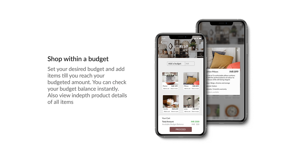
Some of the key features added to solve the existing problems are:


Day 5: Test
The last day of the sprint focussed on testing the finished prototype with 5 users. I picked users who had moved into a new apartment within the past year.
The task given to the users was to use the application and purchase decor for their apartment within a budget
Some of the feedback received from the usability tests were:
“The user wanted an option to be able to view individual products eg. if he wanted to buy a clock, he did not wish to go through each theme to view the clocks. Here an “All Products” view would come in handy”
“A user was confused about the AR- 3D model as it was a static screen that looked like a photograph in the prototype. I explained that it would be an AR model in 3D that can be moved, resized, etc in reality using your camera — that solved the doubt”
“One user noted that once a budget is added for eg. Rs 1000, the app should filter products that fit within that budget. The option to “filter by budget” can be added here”
Conclusion
The 5 days GV Design Sprint was a very effective way to come up with ideas and validate them in a time-effective manner. The process helped me design a solution for the problem at hand efficiently and undertake the entire design process within a week’s time.
In the next release of this product, I would want to add a search functionality, more filtering options, and new themes/categories.
Thank you for reading my case study! 😀